History
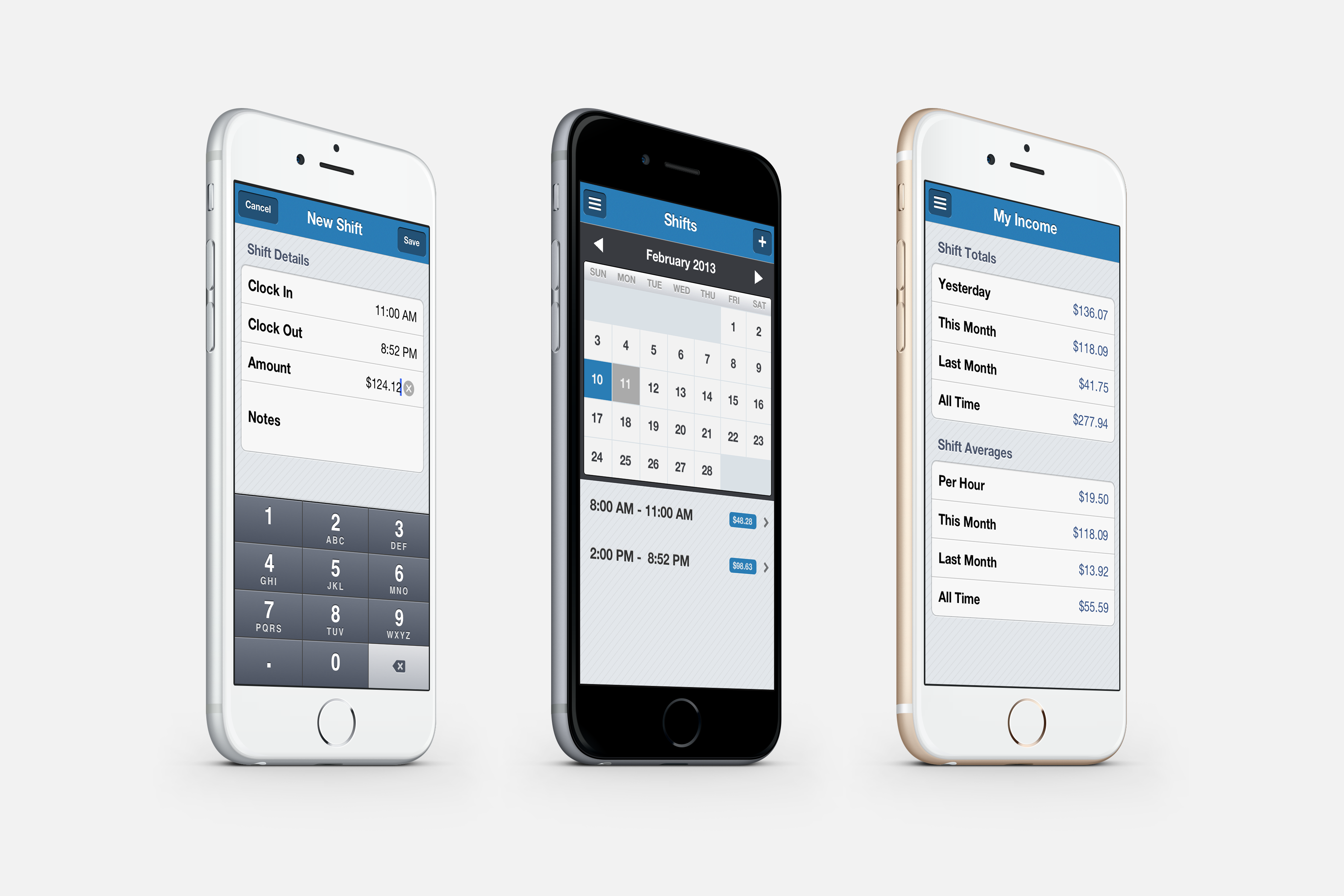
User interface design wasn’t always as we would think of it today. It started back in the 40’s with Batch UI. Computers punching holes in cards and creating commands. In the 60’s we had screens and used Command Line UI, similar to a terminal. Apple changed how all of this worked in 1984 with the Macintosh. Creating the point and click interface as we know it today. Since then we have been able to really design how a person is interacting with digital items.
In 2007 we made a major change with touch screens being integrated into mobile devices. With every change in product changed how we could interact with the digital assets. Each new milestone in the tech world has allowed new avenues for people to interact with their computer. The mouse, trackpad, stylus, touch-screens, virtual realty, all of these have changed the way were using are bodies to interact with our technology.
Purpose
The goal with UI/UX design is to create something that doesn’t seem new, it seems natural to the user. Whether if this using something that has been done for years and maybe repurposing it, or bring something in humans do naturally and giving it a digital input.
As we move into more of a digital world there are more hurdles to overcome. There are less physical pieces to help the user. This means that the symbols and animations that are used have to show and indicate in some way what the user should do.
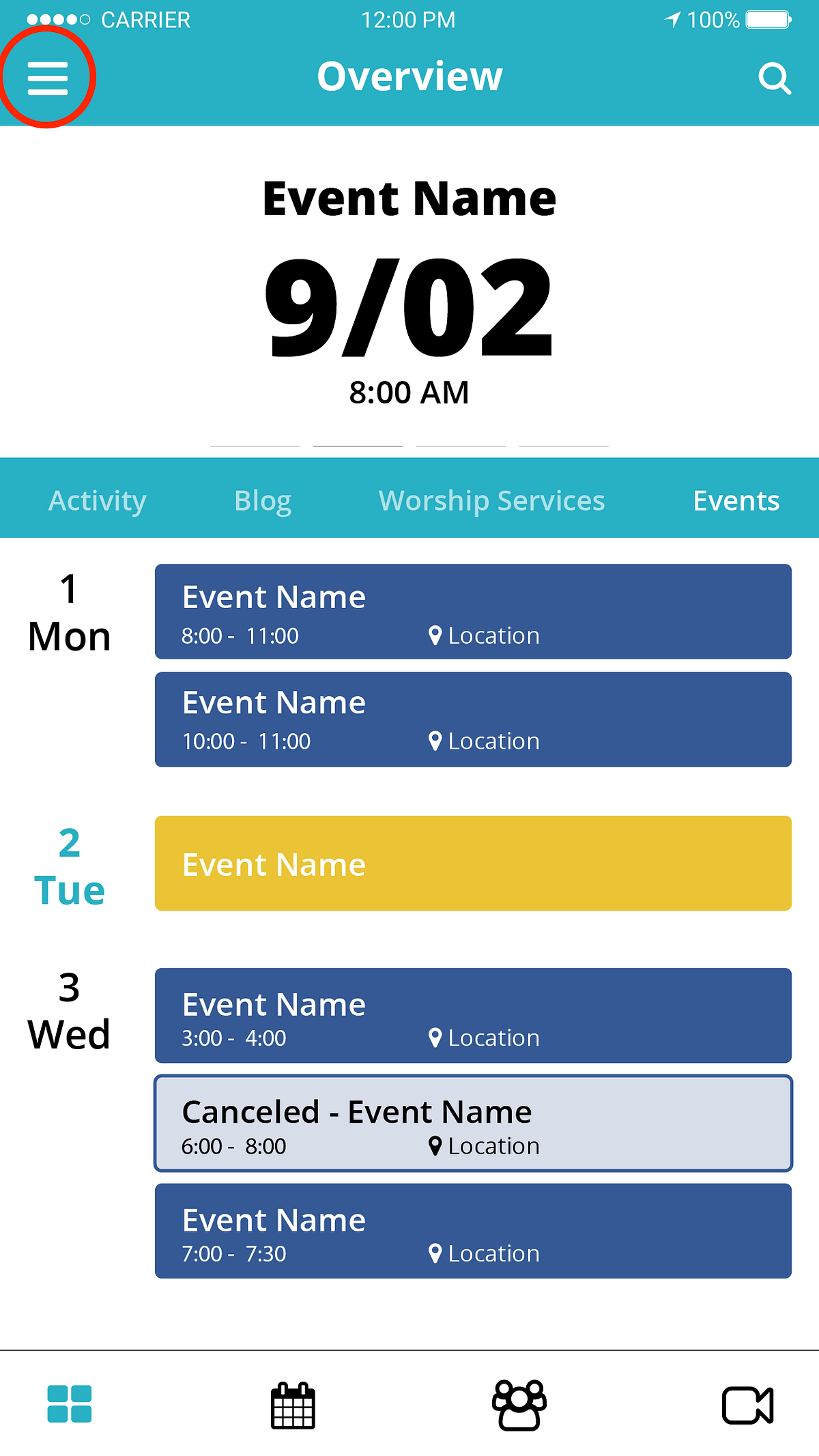
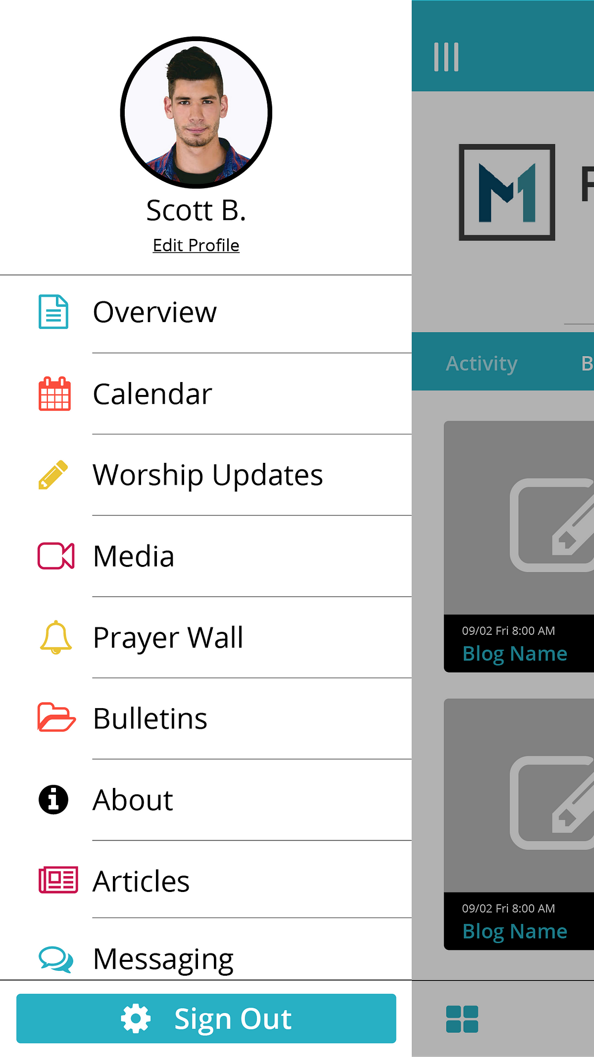
Somethings are just learned over time such as the hamburger menu icon. It is something a company started to using and caught on as an industry trend. Now whenever anyone sees it we know to tap it and get a menu.
Design
There are guidelines in place such as the Principle of least astonishment. This principle states that you should take the path of least surprising in how something works. You don’t want to catch the user off guard by how oddly a function works. You want to minimize the learning curve and use the users previous knowledge to your advantage.
There are eight characteristics to think about when designing for UI/UX:
Familiarity: Ensuring that first time users can find things they are familiar with and branching out from there. In some cases these is keeping the branding and UI/UX the same across platfroms.
Efficiency: Time is money. The user interface should be quickly learned or they should be able to easily access key or common tools.
Consistency: Use templates and similar layouts. Don’t change where buttons are on different pages. Try to create a layout that works in almost every situation.
Aesthetics: Making something easy on the eyes makes people more relaxed and enjoy using the product more.
Clarity: Making sure that the interface is simple, clear, and precise. You want the user to clearly see and understand what they need to do and use.
Responsiveness: The interface needs to let the user know what is happening even if it is loading. So even if things are being slow the user can see that processes are happening and they can be reassured.
Forgiveness: Giving ways to point out and easy correct mistakes that the users made.
Conclusion: its easy to make things clear and organized but double checking and making sure that labels or complex menus aren’t creating more problems than they are solving or create more clutter.
Bringing Branding into your app allows for further and future develpment of other apps and other components to you company. Knowing what your company is about while designing you app is important. Check out our worksheet to help figure out who you company is.
With some of this basic knowledge you can start to break down UI/UX you never really thought about, understand how they did it. Start to analysis and integrrate some of that into your UI designs.


